




A pretty site is not the goal. A site that books moves is. Here is how to design for that.
Good moving company website design puts the booking front and centre: fast pages, a clear quote form above the fold, obvious trust signals, and a mobile-first layout. Whether you build it yourself or work with a website design company, the goal is not to look impressive. It is to make it effortless for a stressed customer to request a move, which is what turns visitors into booked jobs.
Key Takeaways
- A moving company website should be designed to book moves, not just to look good.
- Put a quote form above the fold on every service page, including the homepage.
- Most visitors are on a phone, so mobile-first and fast-loading are non-negotiable.
- Trust signals, reviews, real photos, and clear pricing, do as much selling as the design.
Why Moving Company Website Design Decides Who Gets Booked
Here is a hard truth from experience: not every good-looking website books moves, and not every move-booking website looks good. Plenty of movers pay for a gorgeous site that wins zero jobs, because it was designed to impress, not to convert. Getting the balance right is an art, and it is the whole point of your moving company website.
Think about the person landing on your site. They are stressed, on their phone, comparing three movers at once. They do not want to admire your design. They want to know you are trustworthy and book a move in under a minute. Every design choice either helps them do that or gets in the way.
These 10 tips are built around that one goal: turning visitors into booked jobs. They work whether you run a company in Canada, the US, the UK, Australia, or Dubai. Let’s dive in.
“Design is not just what it looks like and feels like. Design is how it works.” (Steve Jobs, co-founder of Apple)
1. Capture the Booking Above the Fold
This is the single most important rule, so it goes first. The best moving company website designs are built around it.
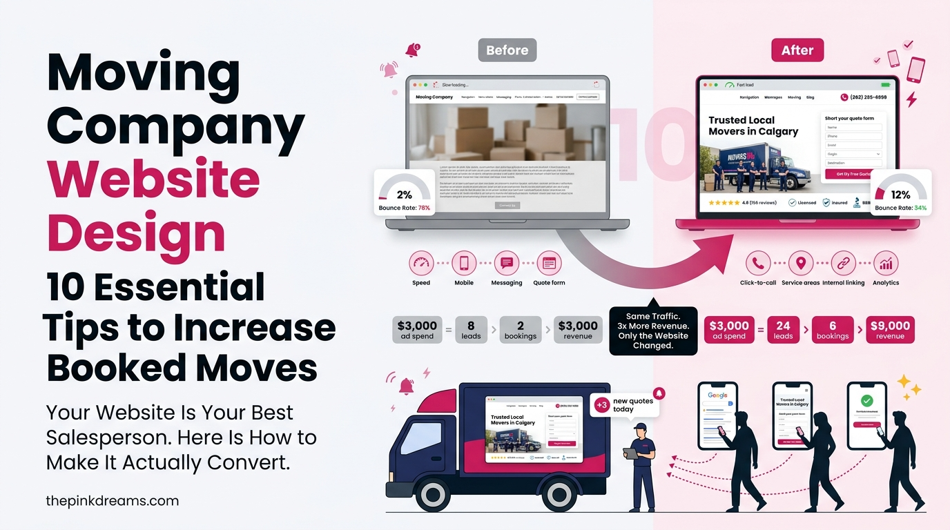
The moment someone lands on a page, the way to book should be right there, no scrolling required. A short quote form or a bold “get a free quote” button in the hero section catches the customer while their intent is highest. Bury it below three paragraphs of “about us” and you lose them.
Quick win: A great-looking website doesn’t always bring in bookings, and a website focused only on conversions may not build trust. The sweet spot is combining both. Add a clear quote request or booking form to the hero section of every service page, including your homepage, so visitors can take action as soon as they land on your site.
2. Design Mobile-First, Not Desktop-First
Most people find a mover on their phone, often mid-move with boxes everywhere.
So design for that small screen first, then scale up. On mobile, the best moving company websites keep forms short, buttons big and tappable, and the phone number one tap away. If your site is a pain to use on a phone, customers bounce, and Google notices.
• Use a responsive layout that adapts to any screen
• Make buttons and form fields easy to tap
• Keep the quote form short: name, contact, move details, done
3. Make It Load Fast
A slow site is a leaky bucket. People leave before they ever see your offer.
Even a one-second delay can cost you bookings. Compress your images, keep the code clean, and use solid hosting. Speed is both a ranking factor and a conversion factor, so it pays off twice.
Quick win: Run your site through a free speed test and fix the biggest offenders first, usually oversized images and heavy plugins.
4. Keep Navigation Simple and Clear
A confused visitor does not book. They leave.
Your menu should make it obvious how to find services, pricing, reviews, and contact. Do not make people hunt. A clean, simple structure guides them toward the quote form instead of leaving them lost.
• Use a short, clear menu with obvious labels
• Put your phone number and a “get a quote” button in the header
• Link related pages so visitors flow toward booking
5. Build Trust With Reviews and Real Photos
Moving is a high-trust purchase, and your design has to prove you are safe to hire. Show it, do not just say it. A steady habit to get more moving company reviews keeps this section fresh and convincing.
• Display real customer reviews and star ratings prominently
• Use genuine photos of your crew, trucks, and completed jobs, not stock
• Show any licences, insurance, or certifications that build confidence
These are the details a nervous customer scans for before they trust you with everything they own. Strong moving company website reviews, shown right on the page, quietly close the deal.
6. Write Clear Service and Location Pages
One page cannot rank or convert for everything. Give each service and area its own page, each with its own booking form. This is also where your moving company SEO and your design work together.
• Separate pages for local, long-distance, and commercial moves
• Location pages that name the neighbourhoods and cities you serve
• A quote form in the hero of every one of them
Quick win: Audit your service pages. If any one of them is missing a booking form above the fold, that is your next fix.
7. Make Your Calls to Action Impossible to Miss
If a visitor has to search for how to book, you have already lost them.
Your main call to action, “get a free quote” or “book your move,” should stand out in colour, sit above the fold, and repeat down the page. Every screen a customer sees should have an obvious next step.
8. Design With SEO Built In
A beautiful site nobody can find is a waste. Good design and SEO go together.
Structure the site so Google can read it: clear headings, descriptive page titles, fast load times, and clean URLs. When your design and your search setup pull in the same direction, you get found and you convert.
• Use one clear H1 and logical headings on every page
• Name your city and services in titles and page copy
• Keep URLs short and descriptive
9. Add Simple Tools That Capture Leads
The right tools turn a browsing visitor into a booking. Even small features move the needle on moving leads.
• An instant quote or estimate widget
• A click-to-call button that works on mobile
• A downloadable moving checklist that captures an email
• A simple online booking or scheduling option
Each one gives a customer a low-pressure way to take the next step on their own schedule.
10. Keep the Design Consistent and Current
A site is not a one-time build. Left alone, it goes stale, and a dated look quietly costs you trust. Consistent, fresh design is part of your wider digital marketing for moving companies.
• Use the same colours, fonts, and logo across every page
• Refresh photos and reviews so the site looks active
• Keep the design modern, since an outdated look reads as an outdated company
Quick win: Open your homepage next to two competitors. If yours looks older or slower, that is a booking problem, not just a style one.
Cheap vs Custom Moving Company Website Design: Which Gets More Bookings?
A fair question, because budgets are real.
Here is the honest answer. A cheap moving company website can work fine if it nails the fundamentals: fast, mobile-first, and a quote form above the fold on every service page. Price is not what books jobs. Conversion design is. A modest site built around the booking will out-earn an expensive one built around looking impressive. Spend on the parts that convert, not the parts that only decorate.
Build a Moving Company Website That Wins More Bookings
The best moving company website is not the prettiest one. It is the one that makes booking effortless.
Design every page around that single job: fast load, mobile-first, trust on display, and a quote form waiting in the hero the moment a customer arrives. Do that and your site stops being a brochure and starts being your best salesperson. You do not have to rebuild everything at once. Add a booking form above the fold on your top service page this week, and go from there.
And if you would rather hand the design and upkeep to a team that builds for bookings, Pink Dreams can help across all five markets.
FAQ
What makes a good moving company website?
A good moving company website loads fast, works cleanly on mobile, and puts a quote form above the fold on every service page. It shows real reviews, genuine photos, and clear pricing, and makes booking effortless. The goal is not to look impressive, it is to make a stressed customer confident enough to request a move in under a minute.
How much should a moving company website cost?
It varies widely, from budget templates to custom builds. But price is not what books jobs. A cheap moving company website that is fast, mobile-first, and built around a clear booking form will out-earn an expensive one designed only to look good. Spend on the parts that convert, not the parts that just decorate.
What pages should a moving company website have?
At minimum: a homepage, separate service pages for local, long-distance, and commercial moves, location pages for the areas you serve, an about page, reviews, and contact. Each service and location page should have its own quote form above the fold so a customer can book from wherever they land.
How do I get more bookings from my website?
Put the booking front and centre. Add a quote form above the fold on every service page, keep the site fast and mobile-friendly, show reviews and real photos, and make your call to action impossible to miss. Most bookings are lost to friction, so remove every extra step between landing and requesting a quote.
Do I need to keep updating my website after it launches?
Yes. A site left alone slowly goes stale: the design dates, content gets old, and trust erodes. Refresh photos and reviews, keep the look modern, and check that forms and load speed still work. Ongoing upkeep is what keeps a moving company website converting rather than quietly working against you.

Digital Marketing Strategist & Business Coach
As a leading digital marketing strategist and business coach, he is responsible for helping entrepreneurs and brands grow faster in a smarter, more scalable way. With over 20 years of experience, Nagarajan specializes in practical coaching, automation-first marketing strategies, and technology-driven growth systems. His work focuses on enhancing brand visibility, improving performance, and building sustainable frameworks that enable long-term business success.