




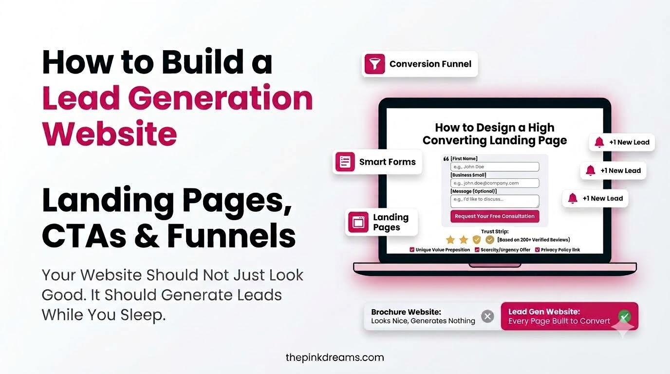
How to turn a website that just sits there into one that produces enquiries.
Your website gets visitors. You cannot tell what any of them did, and the phone is not ringing because of it. That is not a traffic problem, it is a structural one.
How to build a lead generation website comes down to three things working together: landing pages that ask for one thing, calls to action that make the next step obvious, and a funnel that moves people between them. Most small business sites have none of the three, which is why traffic from SEO services never converts. The fix is not a redesign. It is usually three pages and a form.
Key Takeaways
- A lead generation website is built around a single action per page. A brochure site is built around describing the business.
- You do not need to rebuild your site. Most small businesses need three focused pages, not forty redesigned ones.
- Landing pages convert because they remove choices, including the navigation menu.
- Every page needs one primary call to action, repeated, in language that names what happens next.
- The funnel is the part small businesses skip, and it is why enquiries arrive unqualified or not at all.
- Lead magnets do not need to be ebooks. For a local service business, a quote, a checklist or an audit works better.
- Every extra form field costs you enquiries, so ask only for what you need to make contact.
- Trust signals do more for conversion than design does, and they are cheaper to add.
What Separates a Lead Generation Website From a Brochure Site
Most small business websites are brochures. They explain who you are, list what you do, and finish with a contact page nobody uses. Everything on them is accurate and none of it asks the visitor to do anything.
A lead generation website is organized around actions instead of information. Each page has a job, and that job is to move one specific person one step closer to contacting you. The content is often similar. The structure is completely different.
Three differences matter most:
Focus. A brochure page describes five services. A lead generation page addresses one problem and offers one next step. Choice is the enemy of action, and a visitor presented with six equally weighted options usually takes none of them.
Direction. A brochure site leaves visitors to navigate themselves. A lead generation site always tells them what to do next, on every page, without them having to look for it.
Measurement. A brochure site reports visits. A lead generation site reports enquiries, and tells you which page produced each one. Until you can answer that question, every marketing decision you make is a guess.
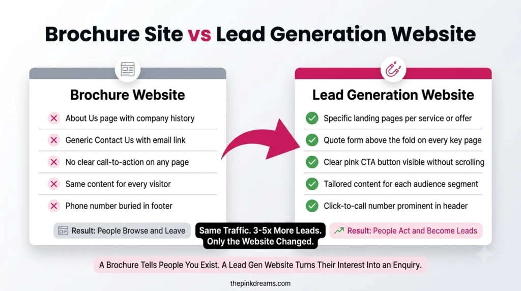
Key Takeaway: You probably do not need a new website. You need a few pages that ask for something instead of describing something.
How to Build a Lead Generation Website: Start by Auditing What You Have
Before building anything, spend an hour finding out how the current site performs. Most owners discover the problem is narrower than they feared.
Look at four things:
• Which pages get the most visits. These are the pages worth fixing first, because they already have an audience. Improving a page nobody visits improves nothing.
• Where people leave. A page with high traffic and a high exit rate is usually promising something the page does not deliver, or offering no next step at all.
• How fast it loads on a phone. Most visitors are on mobile, and a slow page loses them before any of your copy gets a chance.
• How many enquiries you can actually trace. If the answer is none, fixing the tracking comes before fixing anything else, because otherwise you will never know whether the changes worked.
Then do the thing that is worth more than any tool: open your own site on your phone and try to hire yourself. Find a service, understand the price, and make contact. Time it. Most owners are surprised by how long it takes and how many decisions they are asking a stranger to make.
Key Takeaway: Fix your highest-traffic page first and confirm you can track enquiries. Both come before any design work.
Pillar One: Lead Generation Landing Pages That Convert
A lead generation landing page is a page built to capture contact details in exchange for something specific. It is not your homepage, and it is not a services page with a form stuck at the bottom.
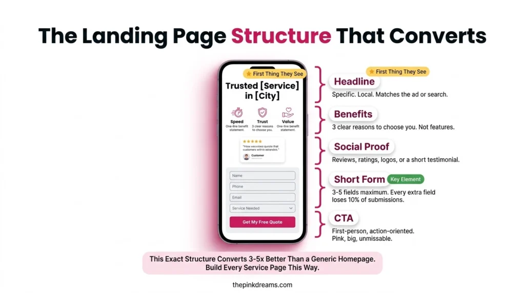
What makes it different is subtraction. A proper landing page removes the navigation menu, the footer links, the related articles and everything else that offers an exit. The visitor arrives with one thing to consider and one thing to do.
The structure that works is consistent across industries:
• A benefit-driven headline that names the outcome, not the service. “Get your bathroom quoted in 24 hours” beats “Bathroom renovation services.”
• A supporting line that explains who it is for and what happens next.
• One image showing the actual work, the actual team, or the result. Not stock photography of people in a meeting.
• Three to five benefits written as what the customer gets, not what you provide.
• Social proof placed near the form, where hesitation happens.
• One form, kept short.
• The call to action is repeated at the top and again at the bottom, so people who scroll do not have to scroll back.
The most common small business mistake here is sending paid traffic to the homepage. If you are running ads, the page they land on should match what the ad promised, which is covered in our guide to how to advertise your business on Facebook. A mismatch between ad and page wastes most of what you spent to get the click.
Key Takeaway: Build one landing page per offer, strip the navigation, and match the page to whatever brought the visitor there.
Pillar Two: Calls to Action That People Actually Click
The call to action is the smallest element on the page and the one that decides whether any of it worked.
Weak calls to action fail in predictable ways. They are vague, so nobody knows what happens after clicking. They are passive, so nothing feels urgent. They appear once, halfway down, where only the most determined visitor finds them. Or there are four of them competing, so the page pulls in several directions at once.
What works:
• Name the outcome, not the mechanic. “Get my free quote” beats “Submit.” “Book my site visit” beats “Learn more.”
• Write it in the visitor’s voice. The first person often outperforms the second, because the button reads as the visitor’s decision rather than your instruction.
• Make it visually obvious. A contrasting colour, real whitespace around it, and a button large enough to tap comfortably on a phone.
• Repeat it. Top of page, after the benefits, and at the end. People decide at different moments.
• Set expectations underneath. A short line saying what happens next, such as a reply within one working day, removes the hesitation that stops people clicking.
How many should a page have? One primary action, repeated as often as makes sense. A secondary action is acceptable only if it is clearly lower priority, such as a phone number for people who would rather call. Two equally weighted calls to action halve the effect of both.
Key Takeaway: One primary action per page, repeated, naming the outcome. Everything else is a distraction dressed up as a helpful option.
Pillar Three: The Conversion Funnel That Connects Them
Landing pages and calls to action are components. The funnel is what makes them a system, and it is the part small businesses skip almost universally.
A funnel is simply the recognition that people arrive at different stages of readiness, and that asking all of them for the same thing wastes most of them.
At the top, people have a problem but do not know you exist. They need content that helps, not a sales pitch. Blog posts, guides and useful answers belong here, which is where content marketing services do the work.
In the middle, people are comparing options. They need proof: case studies, reviews, before and after work, clear pricing information. This is where most small business sites go silent, and it is where most decisions are actually made.
At the bottom, people are ready. They need a quote form, a booking link, a phone number, and no obstacles. This is also where search advertising earns its money, since PPC and paid search management captures people already looking for exactly what you sell.
The mistake is building only the bottom. A site with a contact form and nothing else captures the small percentage who arrived ready and loses everyone else permanently. Adding a middle stage, even just a proper reviews page and a clear pricing explanation, usually produces more enquiries than any redesign.
Paid traffic makes this more urgent rather than less. If you are sending ads to a page with no funnel behind it, you are paying for interest and then abandoning it, which our guide on Facebook and Instagram advertising ROI strategies covers in detail.
Key Takeaway: Build the middle of your funnel. It is where the decision happens and where almost every small business site is empty.
Lead Magnets Small Businesses Can Realistically Offer
Every guide on this topic recommends ebooks, whitepapers and interactive calculators. For a plumber, a salon or an accountant, that advice is useless.
A lead magnet is anything valuable enough that someone will trade their contact details for it. For a local service business, the best ones are things you already produce:
• A fast quote. Not a contact form, but a specific promise: details and a price within one working day.
• A checklist. What to look for before hiring in your trade, or what to prepare before an appointment.
• A free assessment or audit. A short review of their situation, which doubles as a sales conversation.
• A price guide. The thing everyone wants and almost nobody publishes. Ranges with explanations beat silence.
• A seasonal reminder service. Useful for anything with an annual cycle, such as servicing or filings.
The test is not how impressive it sounds. It is whether the person would feel the trade was fair. A genuinely useful two-page checklist outperforms a padded twenty-page guide almost every time.
Key Takeaway: Offer something you already know. Speed and specificity beat production value for local businesses.
Lead Capture Forms: How Many Fields Before People Quit
Every field you add costs you enquiries. That is the whole principle, and most small business forms ignore it entirely.
Ask only for what you need to make contact and give a useful reply. For most local businesses that is a name, one contact method, and one line about what they need. Everything else, including company name, budget range and how they heard about you, can be asked in the conversation that follows.
Two refinements worth knowing:
Longer forms are not always wrong. A longer form filters out casual enquiries, which is useful if you are drowning in unqualified leads. If you are short of enquiries, shorten it. If you are short of good enquiries, lengthen it deliberately.
Multi-step forms often outperform long ones. Splitting six fields across three small steps feels lighter than six fields at once, because each step looks trivial and people finish what they start.
Make it work properly on a phone. Large tap targets, the correct keyboard for each field, no pinch-zooming, and a confirmation message that tells people what happens next rather than just saying thank you.
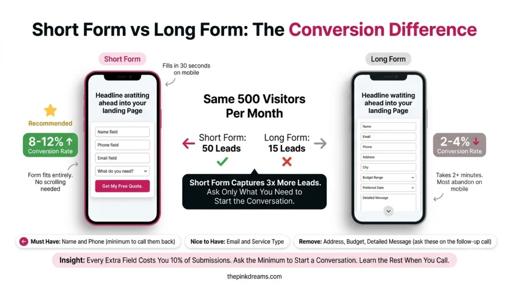
Key Takeaway: Short forms for more enquiries, longer forms for better ones. Decide which problem you have before changing anything.
Trust Signals: The Social Proof That Removes Doubt
People do not hesitate because your design is wrong. They hesitate because they do not know whether you are any good, and adding proof is far cheaper than redesigning anything.
What genuinely helps, roughly in order:
• Reviews with names and locations, placed next to the form rather than hidden on a separate page.
• Photographs of real work, especially before and after. For trades this outperforms every other element on the page.
• Faces of the actual team. People trust a person more readily than a logo, and you have one available.
• Accreditations, insurance and memberships, stated plainly rather than as an unexplained badge.
• Specific numbers you can honestly stand behind, such as years trading or jobs completed.
• A local address and a real phone number, which quietly separate you from businesses that have neither.
Place these where doubt occurs, which is next to the point of commitment. Proof at the bottom of a page nobody scrolls to is proof nobody sees.
Key Takeaway: Put your reviews and your work photos beside the form, not on a separate page.
The Weekend Version: The Smallest Lead Generation Website That Works
If you have one weekend and no budget, this is what to build. It is not a compromise. For most small businesses it outperforms the forty-page site they were planning.
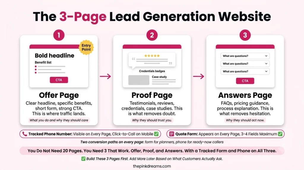
Page one, the offer. One landing page for your most profitable service. Headline naming the outcome, three benefits, photos of real work, three reviews, one short form, call to action repeated twice.
Page two, the proof. Your work, your reviews, your prices or price ranges, your team. This is the middle of the funnel and the page that does the convincing.
Page three, the answers. The questions customers actually ask before hiring, answered plainly. This page earns search traffic and removes objections at the same time.
Plus three things: a tracked form so you know which page produced each enquiry, a phone number visible on every page, and a same-day response process written down.
That is the entire build. Everything else people worry about, including the redesign, the CMS choice and the twenty service pages, can wait until this version is producing enquiries. If it is not producing enquiries, a bigger site will not fix that.
Key Takeaway: Three pages, one form, tracked. Build that before you consider anything larger.
How to Tell If It Is Working
Judge the site on enquiries, not traffic. Traffic without enquiries is a structural problem, and more traffic makes it more expensive rather than better.
Watch four things:
• Enquiries per week, by page, so you know what is producing and what is decoration.
• Conversion rate on your main landing page, which tells you whether the page or the traffic is the weak link.
• Form completion rate, since a gap between people who start and people who finish usually means the form is too long.
• Enquiry quality, tracked manually if necessary. Twenty enquiries from outside your service area are worth less than three local ones.
Then do the unglamorous thing: ask every new enquiry how they found you. On small volumes, a tally on a notepad is often more honest than any analytics dashboard, and it costs nothing.
Key Takeaway: Count enquiries by page, and ask every caller how they found you. That combination beats most reporting setups.
Closing: Build Small, Then Add
Knowing how to build a lead generation website is mostly knowing what to leave out. The sites that produce enquiries are not the ones with the most pages or the newest design. They are the ones where every page asks for one thing, the next step is always obvious, and there is something useful waiting for people who are not ready yet.
So resist the redesign. Pick your most profitable service, build one landing page for it, add a proof page and an answers page behind it, and make sure you can tell which one produced each enquiry. Give it a month.
If three pages do not produce enquiries, forty will not either, and you will have learned that for the price of a weekend rather than a rebuild.
And if the harder problem is getting the right people to those pages in the first place, Pink Dreams can help. Pink Dreams is a digital marketing agency that helps businesses attract more customers through search, paid media, content and conversion-focused strategy. Our team reviews your current site and visibility, builds a customised roadmap, and handles the work needed to turn visits into enquiries. Request a free digital presence audit to see where you stand.
FAQ
What is a lead generation website?
A website structured around capturing enquiries rather than describing a business. Each page has one clear action, calls to action are repeated and specific, and there is content for people at different stages of readiness. The difference from a brochure site is structural rather than visual.
Do I need a separate landing page, or can I use my homepage?
Use a separate landing page for any campaign or specific offer. Homepages have to serve everyone, so they cannot focus on one action, and they carry navigation that gives visitors somewhere else to go. Sending paid traffic to a homepage wastes most of what you paid for the click.
How many fields should a lead capture form have?
As few as you need to reply properly, usually a name, one contact method and a line about what they want. If you are receiving too many unqualified enquiries, add a field or two deliberately to filter. If you are short of enquiries, cut the form down.
What lead magnet works best for a small local business?
A fast, specific quote is usually the strongest, followed by a checklist or a free assessment. Ebooks and whitepapers rarely suit local service businesses. The test is whether the person would consider the exchange fair, not whether the offer sounds impressive.
How long does it take to build a lead generation website?
A working version takes a weekend: one landing page, one proof page, one answers page, and a tracked form. A full site takes considerably longer, but building the full site first is how most small businesses spend months without discovering whether any of it produces enquiries.

Digital Marketing Strategist & Business Coach
As a leading digital marketing strategist and business coach, he is responsible for helping entrepreneurs and brands grow faster in a smarter, more scalable way. With over 20 years of experience, Nagarajan specializes in practical coaching, automation-first marketing strategies, and technology-driven growth systems. His work focuses on enhancing brand visibility, improving performance, and building sustainable frameworks that enable long-term business success.