




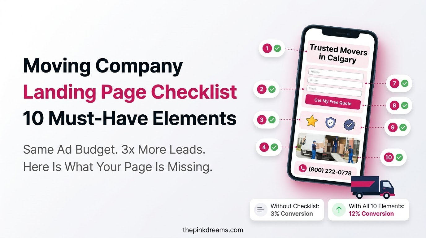
10 elements every mover’s landing page needs to turn clicks into booked jobs.
A homeowner clicks your ad, lands on your page, and decides within seconds: request a quote or hit back and call a competitor. Your moving company landing page is where that decision is won or lost, and the gap between a page that converts and one that doesn’t usually comes down to a handful of elements in the right places. Strong lead generation for movers starts here, because even great ads waste the budget if the page they point to can’t convert. This checklist covers the 10 must-have elements that turn clicks into booked moves, what each one does and how to get it right.
Key Takeaways
• A landing page has one job: convert a visitor into a quote request or call, no distractions.
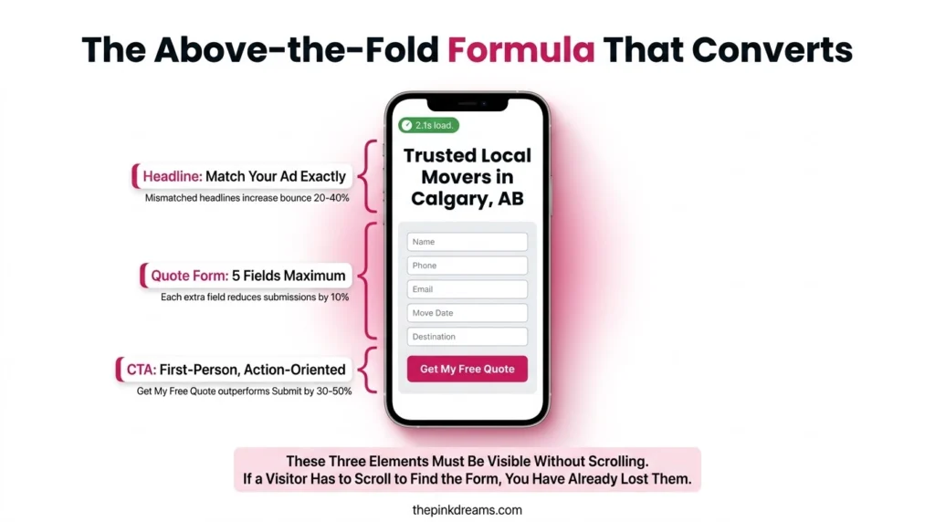
• The headline, quote form, and a trust signal must all be visible without scrolling.
• Match the page to the ad or search term that brought the visitor, or bounce rates climb.
• Real photos, reviews, and trust badges beat stock imagery and vague claims every time.
• Most traffic is mobile, so mobile speed and tap-to-call are non-negotiable.
• Capture after-hours inquiries automatically, since many moving leads arrive outside office hours.
• Send every form straight into your CRM, not an email inbox that gets missed.
Why Your Moving Company Landing Page Decides Bookings
Your moving company landing page matters because it’s the single page that turns ad spend into booked jobs or wasted clicks. A homepage invites visitors to browse; a landing page drives one action. When your Google Ads for movers send traffic to a focused page instead of a cluttered homepage, the same budget produces far more leads.
What’s changed is the speed of judgment. Visitors decide in seconds, mostly on mobile, whether your page looks trustworthy and easy to act on. The movers winning today aren’t the ones with the flashiest sites, they’re the ones whose page answers “who are you, what do you do, where, and how do I book” at a glance.
That’s why these ten elements sit at the centre of any paid-traffic strategy rather than being nice-to-haves. Get them right once and every click you pay for works harder.
The 10 Must-Have Landing Page Elements for Movers
These ten elements cover almost everything a high-converting moving company landing page needs: a clear headline, an above-the-fold quote form, strong CTAs, trust signals, real photos, mobile-friendly design, fast loading, service-area info, an FAQ, and click-to-call with after-hours capture. If you improve only a few things first, focus on the first three because they have the biggest impact on conversion rates.
1. Clear, location-specific headline
Your headline should say who you are, what you do, and where, in one line. “Trusted Local Movers in [City]” beats “Welcome to Our Website.” Crucially, match the headline to the ad or search term that brought the visitor; a mismatch between what they searched and what they see drives them straight back to the results page.
2. Quote request form above the fold
Place a short quote form where visitors see it without scrolling. Keep step one to about five fields, name, phone, email, and origin and destination (postal/zip code or suburb). Every extra field costs you submissions, so save detailed questions for a follow-up step. Send submissions straight into your CRM so no lead sits unseen in an inbox.
3. Strong call-to-action buttons
A specific, benefit-led button like “Get My Free Quote” outperforms a generic “Submit.” First-person phrasing (“Get My Quote”) tends to beat “Get Your Quote.” Put your primary CTA above the fold beside the form, repeat it at the bottom for visitors who scroll, and give it a contrasting colour so it stands out from everything else on the page.
4. Trust signals and customer reviews
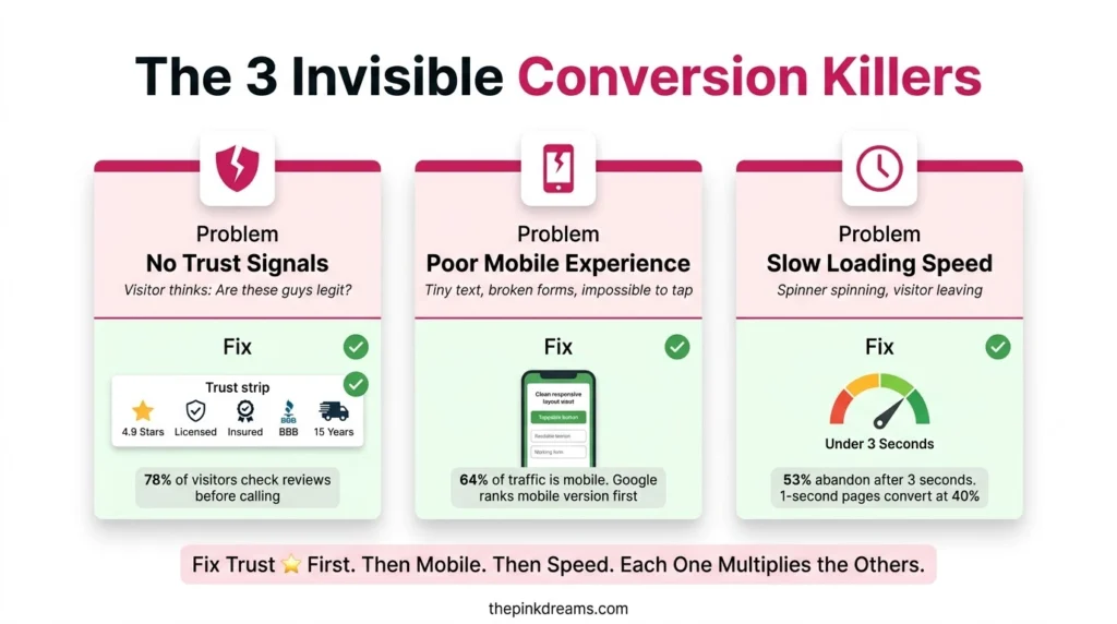
Show your star rating and review count near the headline, and place trust badges in a simple strip: licensed, insured, and any recognised trade body or review platform for your market (such as CAM or HomeStars in Canada, BAR in the UK, AFRA in Australia, or the BBB in North America). A steady flow of Google reviews for movers is the single strongest signal here, so feature two or three short testimonials near the form. Visible social proof converts far better than none.
5. Real photos of your trucks and crew
Stock photos quietly destroy credibility. Use real images of your branded truck, uniformed crew, and completed moves, and if you’re family-owned, add a team photo. Customers are letting strangers into their home, so they want to see who’s actually turning up. Authentic photos reassure in a way polished stock never will.
6. Mobile-friendly design
Most web traffic is now mobile, and search engines judge your site on its mobile version, so the page must work flawlessly on a phone. That means tap-to-call phone numbers, forms that are easy to complete on a small screen, text readable without zooming, and buttons big enough to tap without frustration. Always test on a real smartphone before launch.
7. Fast page loading speed
Most mobile visitors abandon a page that takes more than about three seconds to load, and mover sites are often slow because of heavy, uncompressed photos. Compress every image, aim for well under a few hundred KB each, and test your page in a free tool like Google’s PageSpeed Insights. Faster pages hold visitors and rank better.
8. Service area information
State clearly which cities, suburbs, or regions you serve, and add a map embed so it’s obvious at a glance. For long-distance, interstate, or interprovincial movers, list specific corridors (for example “[City] to [City]”). Strong service-area content is also the backbone of SEO for moving companies, helping you rank for local searches in every place you actually cover.
9. Frequently asked questions
Answer the three to five questions customers always ask, such as “Are you insured?”, “How fast can I get a quote?”, and “Do you offer packing?”. A short FAQ removes hesitation before it becomes a lost lead, and it helps you show up for question-based and voice searches. Keep answers short, honest, and specific to your service.
10. Click-to-call and after-hours capture
Display your phone number prominently and make it tap-to-call on mobile. Because a large share of moving inquiries happen outside business hours, add an auto-responder (SMS or email) confirming receipt and promising a callback, plus a simple chatbot to capture a name and number when your office is closed. That stops after-hours leads from dialing the next mover on the list.
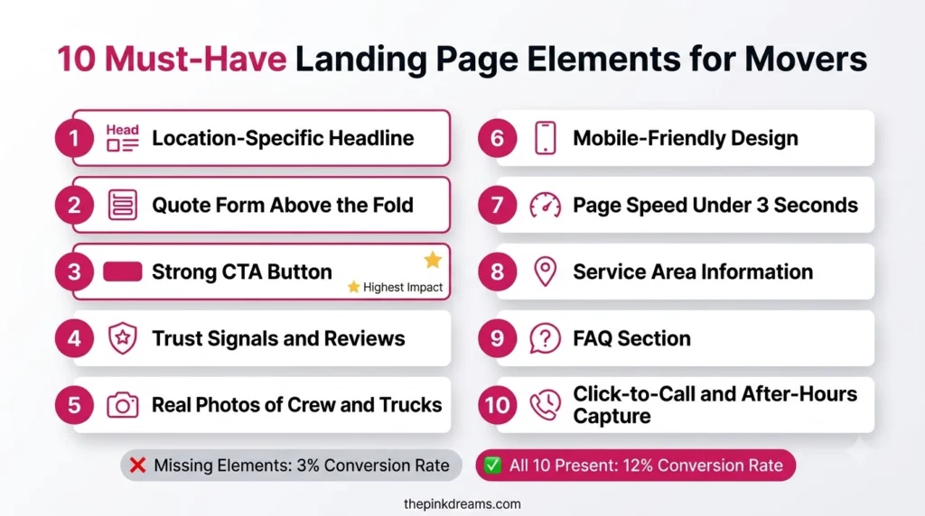
Key Takeaway: Build the checklist top to bottom; the headline, above-the-fold form, and CTA do the heaviest lifting, so nail those first.
Common Landing Page Mistakes Movers Make
The most common landing-page mistakes come from treating the page like a homepage or making visitors work too hard. A landing page should strip away distractions and point every element at one action. Avoid these errors and your conversion rate climbs without spending an extra cent on ads.
• Sending ad traffic to your homepage: a homepage invites browsing; paid clicks need a focused page with one goal.
• Headline-to-ad mismatch: if the page doesn’t echo what the visitor searched, they bounce.
• Long forms: every extra field costs submissions. Ask the minimum up front.
• No visible trust signals: without reviews or badges above the fold, visitors hesitate and leave.
• Ignoring mobile and speed: a slow, hard-to-tap page loses the majority of visitors who arrive on a phone.
Key Takeaway: Most landing-page losses come from homepage clutter, form friction, and slow mobile pages. Fix those three first.
Score Your Landing Page Before Your Next Campaign
Before you spend on ads again, grade your current page against the ten elements. Give yourself one point for each that’s clearly in place. The score tells you exactly where to spend your effort, and it turns “the page underperforms” into a specific, fixable list.
| Score | What it means | Do this next |
| 8–10 | Conversion-ready | Run ads with confidence; A/B test the headline and CTA to push higher. |
| 5–7 | Leaking leads | Fix the above-the-fold trio (headline, form, CTA) and add trust signals first. |
| 0–4 | Losing most clicks | Rebuild around the five-second test before spending another dollar on traffic. |
Turn More Landing Page Visitors Into Booked Moves
If you change only one thing this week, make the above-the-fold trio unmissable: a headline that matches your ad, a five-field quote form, and a benefit-led CTA, all visible before anyone scrolls, on a phone. That single band of the page decides the majority of your conversions. Everything else, including reviews, photos, page speed, and FAQs, builds on a landing page that already gets the basics right.
A landing page is never truly finished, it’s tuned. Match every landing page to the city or service you’re promoting, fix the biggest gap your score revealed, then improve one element at a time. Let your conversion rate tell you what’s working.
| Rule of thumb: if a stranger can’t tell what you do, where you do it, and how to book, within five seconds on a phone, fix that before anything else. |
Want a second set of eyes on your page? Pink Dreams handles landing page design, conversion optimisation, and digital marketing for movers across Canada, the US, the UK, Australia, and the UAE. Request a free landing page audit and we’ll show you the fastest wins on your current page.
FAQ
What is a moving company landing page?
A moving company landing page is a standalone page built for one purpose: converting a visitor into a lead through a quote request or phone call. Unlike a homepage, it removes navigation and distractions and points every element, headline, form, and CTA, at a single action, which is what makes it convert.
How is a landing page different from a homepage?
A homepage serves general visitors with navigation to many sections; a landing page serves one campaign with a single conversion goal. Paid ad and search traffic should always go to a focused landing page, never your homepage, because matching the page to the visitor’s intent dramatically improves conversion.
What should every moving company landing page include?
The ten elements in this checklist: a location-specific headline, an above-the-fold quote form, strong CTAs, trust signals and reviews, real photos, mobile-friendly design, fast loading, service-area information, a short FAQ, and click-to-call with after-hours capture. Together they answer the visitor’s questions and make booking effortless.
How can a landing page increase bookings?
A focused landing page converts a far higher share of visitors than a general homepage, so you get more leads from the same traffic and ad spend. By matching the page to the search query and removing friction, movers commonly see several times more quote requests without increasing their budget.
Should movers create separate landing pages for different services?
Yes. Each major service and each city should have its own landing page with a headline that matches the ad and search term behind it. The closer the page mirrors what the visitor searched for, the higher it converts, so a page per city or service consistently outperforms one generic page.

Digital Marketing Strategist & Business Coach
As a leading digital marketing strategist and business coach, he is responsible for helping entrepreneurs and brands grow faster in a smarter, more scalable way. With over 20 years of experience, Nagarajan specializes in practical coaching, automation-first marketing strategies, and technology-driven growth systems. His work focuses on enhancing brand visibility, improving performance, and building sustainable frameworks that enable long-term business success.